CSV to Chart: A Practical Visualization Guide
Learn to turn CSV data into effective visual charts with spreadsheets, Python, or BI tools. This step-by-step guide covers data prep, chart selection, validation, and accessible visualization for reliable CSV-to-chart workflows.

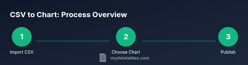
This guide shows you how csv to chart by turning a CSV file into a visual chart using common tools. You’ll learn how to prepare data, select the right chart type, and build repeatable workflows that work in spreadsheets, Python, and BI platforms.
What csv to chart really means
In data work, csv to chart describes the process of turning a raw CSV file into a visual chart that communicates insights quickly. The term captures the end-to-end flow: clean and organize the data, choose an appropriate visualization, and present it in a way that supports decision making. According to MyDataTables, turning CSV data into charts helps reveal trends quickly and supports data-driven decisions. A well-crafted chart converts rows and columns into a story your audience can grasp in seconds, reducing the time spent interpreting numbers. This block explains the rationale, the common pitfalls, and the core steps you’ll reuse across tools like spreadsheets, coding environments, and BI dashboards.
Key idea: consistency in data structure (headers, consistent data types) combined with purposeful chart design yields reliable insights. Throughout this guide you’ll see practical examples, practical checks, and clear guidance you can apply to real CSV files with minimal friction.
The core goal of csv to chart
The goal is not novelty for its own sake but clarity and actionability. A good chart answers a question: What is changing over time? How do categories compare? Are there outliers that deserve attention? By focusing on purpose, you align every step—from data prep to chart type selection—to deliver a narrative that stakeholders expect. This means choosing chart types that match the data structure (time series, categorical comparisons, distributions, or relationships) and avoiding charts that distort interpretation. In practice, you’ll often pivot between a few standard chart types, depending on whether your CSV contains time-data, categories, values, or multi-series comparisons. The path from csv to chart is a repeatable workflow you can document and reuse to keep your visuals accurate.
The audience and accessibility mindset
Accessibility matters from the start. When you convert a CSV to a chart, you should ensure screen readers can interpret the chart, labels are clear, color contrast is sufficient, and the chart remains legible when printed or viewed on different devices. The CSV-to-visual workflow should consider the audience: data analysts may need raw numbers alongside visuals, while business users need concise insights. By embedding accessible titles, axis labels, and alt text, you create visuals that serve a diverse readership. This mindset also makes your charts more robust for dashboards and reports that go through revisions or share across teams.
Tools & Materials
- CSV data file (with headers)(Your source dataset; ensure headers and consistent column data types.)
- Spreadsheet software (Excel or Google Sheets)(Import the CSV and create basic charts without coding.)
- Visualization tool or BI platform (Power BI, Tableau, Google Data Studio, or Excel/Sheets charting features)(Choose a tool you’ll reuse for other CSV-to-chart tasks.)
- Optional: Python environment (pandas + matplotlib/seaborn)(If you prefer programmatic charting or need automation for large datasets.)
- Color palettes and labeling guidelines(Use accessible palettes with clear contrasts and readable labels.)
Steps
Estimated time: 25-40 minutes
- 1
Import and inspect the CSV
Open your CSV in the chosen tool and verify headers, data types, and any missing values. Confirm that date/time fields are recognized as dates when relevant. This ensures the chart draws from clean data rather than raw text. If necessary, perform a quick data type conversion and handle obvious outliers.
Tip: Use data preview features to confirm the first few rows align with column definitions. - 2
Choose the chart type based on data structure
Assess whether you are visualizing trends over time, category comparisons, distributions, or relationships. Time series often use line or area charts; categories favor bar charts; distributions are best with histograms or box plots; relationships suit scatter plots.
Tip: When in doubt, start with a simple line or bar chart and adjust as you confirm the story your data tells. - 3
Create the chart in your tool
Create the chart using the charting features of your chosen tool. Bind the x-axis to the appropriate dimension (date, category, or index) and the y-axis to the numeric series. Add legend entries only for distinct series to avoid clutter.
Tip: Label axes clearly and set a readable title that conveys the question the chart answers. - 4
Refine aesthetics and readability
Tweak colors, line thickness, and marker shapes for clarity. Limit the color palette to 4-6 distinct hues and ensure high contrast for accessibility. Add data labels sparingly to highlight key figures, not every point.
Tip: Enable gridlines only if they aid interpretation; otherwise, remove to reduce visual noise. - 5
Validate accuracy and consistency
Cross-check the chart against the raw data to confirm calculations (sums, averages, rates) are correct. Ensure units and scales are consistent across similar charts in a dashboard.
Tip: Document any transformations (e.g., date parsing, aggregations) so others can reproduce the chart. - 6
Share, export, or embed
Export the chart in a suitable format (PNG, SVG, or interactive embed) and include it with the CSV data in reports or dashboards. Ensure alt text and accessible descriptions accompany the visual.
Tip: If sharing interactively, provide a data table view or a link to the underlying CSV for transparency.
People Also Ask
What is the best chart type for CSV data?
There isn’t a universal best option; choose based on what you want to show—time trends usually use line charts, category comparisons use bar charts, and distributions use histograms.
There isn’t one best chart type; pick based on your data and question.
Can I chart CSV data without programming?
Yes. Spreadsheet apps and BI tools offer robust charting features that handle most CSV-to-chart tasks without code.
Yes, you can chart CSV data using spreadsheets or BI tools without programming.
How do I handle missing values in CSV when charting?
Decide on an approach: imputing, ignoring, or marking gaps. Your choice depends on the data and the chart type you’re using.
Handle missing values by imputing or clearly marking gaps, depending on your chart.
Is CSV to chart accessible for screen readers?
Yes, by adding descriptive titles, axis labels, alt text, and avoiding color-only information to convey data.
Yes, ensure accessibility with labels and alt text.
How large can my CSV be before performance issues appear?
Performance depends on the tool and hardware. For very large files, consider sampling, chunk processing, or using a dedicated data tool.
Large CSVs may require sampling or specialized tools to maintain performance.
How do I keep charts up to date with CSV changes?
Link charts to the CSV source when possible, or refresh data on open and automate data pipelines where feasible.
Link to data sources or set up auto-refresh when possible.
Watch Video
Main Points
- Plan chart type around data structure before visualizing
- Prepare CSV with clean headers and consistent data types
- Choose accessible colors and clear labels
- Validate results against raw data and document steps