CSV to Graph Online: Practical Step-by-Step Guide
Learn how to convert CSV data to a graph online with a repeatable workflow. This guide covers tool selection, data preparation, step-by-step instructions, and exporting graphics for reports.

You will learn how to convert CSV data to a graph online, including selecting a tool, preparing your CSV, creating the graph, and exporting it for reports. Expect practical steps, data-cleaning tips, and best-practice chart choices to visualize trends clearly.
Why graphing CSV data matters for data analysis
In data-driven teams, turning raw CSV data into graphs transforms numbers into insights. When you run a quick analysis on a dataset like monthly sales in a CSV file, a chart immediately reveals trends, seasonality, or outliers that raw rows hide. The csv to graph online workflow is especially powerful because it removes the friction of local software installation and lets you share visuals with teammates in minutes. According to MyDataTables, online CSV-to-graph workflows can speed up exploratory data analysis, especially for teams working across geographies or with non-technical stakeholders. This section explains why visuals trump rows for communicating findings and how a graph can answer questions faster than numbers alone.
Once you understand the goal of your visualization, you’ll choose the right chart type, formatting, and export options. The takeaway is simple: a well-crafted graph turns a messy CSV into a story that stakeholders can act on. Throughout this article we’ll reference practical, repeatable steps you can apply to real datasets, with MyDataTables as your guide for reliable CSV tooling and visualization guidance.
Understanding the basics: CSV to graph online workflows
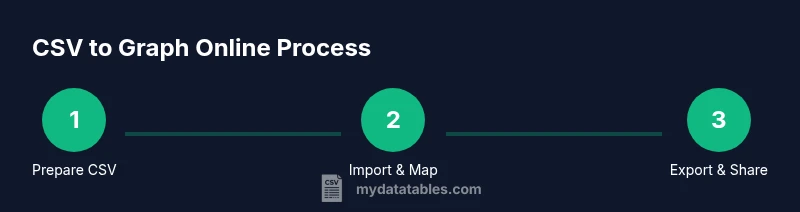
Online graphing of CSV data typically follows a lightweight, repeatable workflow. You upload or paste your CSV into a web tool, map columns to axes and series, choose a chart type, and customize titles, labels, and colors. The key benefit is speed: you don’t install software or write code to sketch an initial visualization. As you scale, you’ll also appreciate the ability to share interactive graphs or export static images with a few clicks.
Two common workflows emerge. The first is importing a CSV file from your computer into an online charting tool, then configuring axes to reflect time or categories. The second is pasting a small subset of data into a tool for quick exploration before committing to a full export. Either path is valid, but your choice depends on data size, privacy concerns, and whether you need interactivity or a static image for a report. For teams relying on CSV data, the online approach minimizes setup time while enabling rapid iteration.
Preparing your CSV for graphing: headers, formats, and cleanliness
Preparation is the silent driver of successful graphing. Start with clean headers that are descriptive but concise. Avoid spaces and special characters; use underscores or camelCase. Ensure consistent data types within each column: numeric values stay numeric, dates are in a standard format (ISO 8601 if possible), and text fields are properly quoted when needed. Missing values should be clearly indicated (e.g., empty cells or a standard placeholder) so the tool can handle them gracefully.
Date handling is a frequent source of error. If you’re charting over time, convert all dates to a single format (YYYY-MM-DD) and keep the time component consistent if needed. If your CSV uses multiple delimiters (commas, semicolons, tabs), normalize to a single delimiter before importing. Finally, confirm that the first row of your CSV contains headers and that there are no stray characters or stray whitespace at line ends. A small data hygiene routine saves you from hours of debugging later.
Choosing an online tool: features to prioritize
Not all CSV-to-graph online tools are created equal. When evaluating options, prioritize features that align with your goals: chart variety (line, bar, scatter, area, heatmap), easy data mapping, and interactivity (tooltip details, zoom, hover effects). Other critical factors include file size support, data privacy assurances, and whether the tool can import directly from URL or cloud storage. If you frequently update data, look for auto-refresh capabilities or re-import workflows.
Consider export formats as well. PNG and SVG exports are common for reports; interactive SVG or HTML embeds may be valuable for web dashboards. Accessibility matters too: ensure color contrasts are legible for color-blind readers and that axis labels are clear. If you’re collaborating across teams, a tool with shareable links or embedded charts can streamline review cycles. MyDataTables recommends evaluating tools for repeatability and data-handling safeguards as you scale.
Step-by-step: convert CSV to graph online
The core workflow for many online tools follows a predictable path. First, you’ll open the tool and import your CSV file. Next, map the data columns to the x- and y-axes and assign any additional series. Then you’ll pick a chart type and fine-tune axis scales, titles, and labels. Finally, you’ll export the visualization or copy embed code for your report or dashboard.
Some tools support drag-and-drop import, others require a file picker. If your dataset is large, consider chunked loading or filtering to a relevant subset before final visualization. Always verify that the resulting graph accurately reflects the data by spot-checking a few data points against the source. This kind of validation prevents misinterpretation in stakeholder discussions.
Visual design tips: selecting chart types and aesthetics
Choosing the right chart type impacts how easily viewers extract meaning. Use line charts to show trends over time, bar charts for category comparisons, and scatter plots to reveal correlations. For datasets with multiple series, use a clear legend and distinct, accessible colors. Avoid clutter by limiting the number of series or using interactive legends that toggle visibility.
Label axes with units and time formats, and keep tick marks readable by avoiding overly dense scales. When color-coding, follow color-blind-friendly palettes and keep contrast high between data and background. If your audience includes non-technical stakeholders, include a concise caption and an executive summary alongside the chart to guide interpretation.
Handling large CSV files and performance tips
Large CSV files can tax online tools. If you anticipate performance bottlenecks, start with a subset of data to validate the mapping and styling before loading the full file. Some tools offer data sampling or progressive loading; enable these features if available. Consider pre-aggregating data in a local step (e.g., using a quick script or a spreadsheet) to reduce the number of data points that need to be plotted.
Another strategy is to split the data into multiple charts, each covering a logical window or category. This approach improves readability and keeps load times reasonable. Always check the tool’s documentation for recommended file sizes and recommended input formats to avoid surprises during import.
Exporting graphs and integrating into reports
After finalizing the graph, export it in the format that best fits your workflow. PNGs are great for slides, while SVGs offer crisp scaling for print or large displays. If the online tool supports vector exports, use SVG for maximum fidelity. Some platforms provide embed codes or interactive widgets; these are ideal for dashboards or internal portals.
When sharing results, include metadata such as data source, date of extraction, and the chart’s purpose. This context helps viewers interpret the visualization and reduces questions later. If you’ll reuse the chart in multiple documents, save a template or preset within the tool so you can reproduce visuals consistently.
Common pitfalls and troubleshooting
Common pitfalls include misinterpreting a chart due to mislabeled axes, failing to handle missing values, or exporting a graphic without context. Always validate the axis units and ensure that the scale conveys the intended message. If the graph looks cluttered, prune extraneous series or switch to a more suitable chart type. Privacy concerns arise when uploading sensitive data to online services; use anonymized data or on-premise tools when necessary.
Troubleshooting tips:
- If data points appear misaligned, double-check the column mapping.
- If colors are indistinct, switch to a higher-contrast palette.
- If the chart imports with garbled headers, re-save the CSV with UTF-8 encoding.
- If interactivity is missing, verify that your export method preserves interactive features or provide a static alternative.
],"toolsMaterials":{"items":[{"name":"Computer with internet access","required":true,"note":"Any modern laptop or desktop will do"},{"name":"CSV data file","required":true,"note":"Unsent to sensitive data or anonymized if needed"},{"name":"Web browser (Chrome/Edge/Firefox)","required":true,"note":"Keep up-to-date for best compatibility"},{"name":"Online CSV-to-graph tool","required":true,"note":"Test a couple to choose the right fit"},{"name":"Text editor (optional)","required":false,"note":"For quick CSV edits before upload"},{"name":"Clipboard or mapping sheet (optional)","required":false,"note":"Jot column roles before mapping"}]},"stepByStep":{"steps":[{"number":1,"title":"Define goal and chart type","description":"Clarify what question the graph should answer and choose an appropriate chart type (line for trends, bar for comparisons, scatter for relationships). This ensures the visualization communicates the right message from the start.","tip":"Document the intended insight to keep steps focused."},{"number":2,"title":"Prepare and validate CSV","description":"Ensure headers are clear, data types are consistent, and missing values are documented. Normalize dates and numeric formats before import.","tip":"Run a quick sanity check on 5–10 rows to catch obvious issues."},{"number":3,"title":"Open tool and import CSV","description":"Launch the selected online tool and import your CSV via file picker or paste. Confirm encoding (UTF-8) and delimiter are correct.","tip":"If available, start with a sample subset to validate mapping."},{"number":4,"title":"Map columns to axes and series","description":"Assign the x-axis to time or category and the y-axis to the measured value. Add additional series if needed and ensure the legend reflects each series clearly.","tip":"Keep the mapping simple to avoid confusion."},{"number":5,"title":"Choose chart type and configure axes","description":"Switch chart type if needed and adjust axis labels, scales, and gridlines for readability. Ensure units are clear and the axis ranges reflect the data’s range.","tip":"Use a reasonable y-axis min to avoid wasted whitespace."},{"number":6,"title":"Customize styling and labels","description":"Add a descriptive title, axis labels with units, and a concise caption. Select accessible colors and ensure the chart remains legible when printed.","tip":"Prefer high-contrast palettes and avoid color-only distinctions for critical data."},{"number":7,"title":"Export or embed the graph","description":"Export the final visualization as PNG/SVG or copy embed code for a webpage or report. Verify that the exported file retains labels and color integrity.","tip":"Save a version with a descriptive filename for future reuse."}],"estimatedTime":"20-40 minutes"},"tipsList":{"tips":[{"type":"pro_tip","text":"Test with a small data subset to validate mapping before loading the full CSV."},{"type":"warning","text":"Large files can slow down tools; consider pre-aggregating data when possible."},{"type":"note","text":"If dates are misinterpreted, reformat to ISO 8601 and reimport."},{"type":"pro_tip","text":"Export in SVG when possible for scalable print quality."}]},"keyTakeaways":["Define your goal before charting.","Prepare clean CSVs to prevent misinterpretation.","Map data accurately to axes and series.","Export high-quality graphics for reports."] ,"videoEmbed":{"videoQuery":"how to convert csv to graph online tutorial"},"faqSection":{"items":[{"question":"What is the best online tool for csv to graph online?","questionShort":"Best tool?","answer":"There isn’t a single best tool for every scenario. Evaluate options based on chart types, data size, privacy, and export options. Try a couple of reputable tools to see which aligns with your workflow.","voiceAnswer":"No one tool fits all cases; test a few to find the best match for your data and reporting needs.","priority":"high"},{"question":"How to handle missing values in CSV when graphing?","questionShort":"Missing values?","answer":"Decide on a policy before graphing: omit, interpolate, or mark as a separate category. The chosen approach should align with your analysis goals and be clearly documented in captions or notes.","voiceAnswer":"Decide how to treat gaps in advance and document it with the graph caption.","priority":"high"},{"question":"What are typical file size limits for online tools?","questionShort":"File size limit?","answer":"Limits vary by tool; check the documentation for the maximum file size and recommended data points. If needed, split the dataset into chunks and create multiple visuals.","voiceAnswer":"Check the tool’s limits and plan to split large datasets if required.","priority":"medium"},{"question":"Is it safe to upload sensitive data to online tools?","questionShort":"Data safety?","answer":"Prefer tools with strong privacy practices or use anonymized data. For highly sensitive data, use on-premise or offline tools to avoid exposure.","voiceAnswer":"Be cautious; when in doubt, anonymize data or choose secure options.","priority":"high"},{"question":"Can I customize colors and labels after importing?","questionShort":"Customize colors?","answer":"Yes. You can usually adjust colors, legend labels, titles, and axis units after import. Some tools also offer presets for consistent branding.","voiceAnswer":"Yes, most tools let you customize visuals post-import.","priority":"medium"}]},"mainTopicQuery":"csv graphing"},"mediaPipeline":{"heroTask":{"stockQuery":"CSV data on laptop with graphs","overlayTitle":"CSV to Graph Online","badgeText":"2026 Guide","overlayTheme":"dark"},"infographicTask":{"type":"process","htmlContent":"<div class="w-[800px] p-8 bg-slate-900 text-white"><h3 class="text-2xl font-bold mb-4">CSV to Graph Online Process</h3><div class="flex items-center\ justify-between"><div class="flex flex-col items-center"><div class="w-16 h-16 rounded-full bg-emerald-500 flex items-center justify-center text-2xl font-bold text-white">1</div><div class="mt-2 text-center text-white text-sm">Prepare CSV</div></div><div class="flex-1 h-1 bg-emerald-500/30 mx-2"></div><div class="flex flex-col items-center"><div class="w-16 h-16 rounded-full bg-emerald-500 flex items-center justify-center text-2xl font-bold text-white">2</div><div class="mt-2 text-center text-white text-sm">Import & Map</div></div><div class="flex-1 h-1 bg-emerald-500/30 mx-2"></div><div class="flex flex-col items-center"><div class="w-16 h-16 rounded-full bg-emerald-500 flex items-center justify-center text-2xl font-bold text-white">3</div><div class="mt-2 text-center text-white text-sm">Export & Share</div></div></div></div>","altText":"Process diagram showing CSV to graph online workflow","caption":"Workflow: prepare CSV → load online tool → map data → export chart"}},
Tools & Materials
- Computer with internet access(Any modern laptop or desktop will do)
- CSV data file(Unsent to sensitive data or anonymized if needed)
- Web browser (Chrome/Edge/Firefox)(Keep up-to-date for best compatibility)
- Online CSV-to-graph tool(Test a couple to choose the right fit)
- Text editor (optional)(For quick CSV edits before upload)
- Mapping sheet (optional)(Jot column roles before mapping)
Steps
Estimated time: 20-40 minutes
- 1
Define goal and chart type
Clarify what question the graph should answer and choose an appropriate chart type (line for trends, bar for comparisons, scatter for relationships). This ensures the visualization communicates the right message from the start.
Tip: Document the intended insight to keep steps focused. - 2
Prepare and validate CSV
Ensure headers are clear, data types are consistent, and missing values are documented. Normalize dates and numeric formats before import.
Tip: Run a quick sanity check on 5–10 rows to catch obvious issues. - 3
Open tool and import CSV
Launch the selected online tool and import your CSV via file picker or paste. Confirm encoding (UTF-8) and delimiter are correct.
Tip: If available, start with a sample subset to validate mapping. - 4
Map columns to axes and series
Assign the x-axis to time or category and the y-axis to the measured value. Add additional series if needed and ensure the legend reflects each series clearly.
Tip: Keep the mapping simple to avoid confusion. - 5
Choose chart type and configure axes
Switch chart type if needed and adjust axis labels, scales, and gridlines for readability. Ensure units are clear and the axis ranges reflect the data’s range.
Tip: Use a reasonable y-axis min to avoid wasted whitespace. - 6
Customize styling and labels
Add a descriptive title, axis labels with units, and a concise caption. Select accessible colors and ensure the chart remains legible when printed.
Tip: Prefer high-contrast palettes and avoid color-only distinctions for critical data. - 7
Export or embed the graph
Export the final visualization as PNG/SVG or copy embed code for a webpage or report. Verify that the exported file retains labels and color integrity.
Tip: Save a version with a descriptive filename for future reuse.
People Also Ask
What is the best online tool for csv to graph online?
There isn’t a single best tool for every scenario. Evaluate options based on chart types, data size, privacy, and export options. Try a couple of reputable tools to see which aligns with your workflow.
No one tool fits all cases; test a few to find the best match for your data and reporting needs.
How to handle missing values in CSV when graphing?
Decide on a policy before graphing: omit, interpolate, or mark as a separate category. The chosen approach should align with your analysis goals and be clearly documented in captions or notes.
Decide how to treat gaps in advance and document it with the graph caption.
What are typical file size limits for online tools?
Limits vary by tool; check the documentation for the maximum file size and recommended data points. If needed, split the dataset into chunks and create multiple visuals.
Check the tool’s limits and plan to split large datasets if required.
Is it safe to upload sensitive data to online tools?
Prefer tools with strong privacy practices or use anonymized data. For highly sensitive data, use on-premise or offline tools to avoid exposure.
Be cautious; when in doubt, anonymize data or choose secure options.
Can I customize colors and labels after importing?
Yes. You can usually adjust colors, legend labels, titles, and axis units after import. Some tools also offer presets for consistent branding.
Yes, most tools let you customize visuals post-import.
Watch Video
Main Points
- Define your goal before charting.
- Prepare clean CSVs to prevent misinterpretation.
- Map data accurately to axes and series.
- Export high-quality graphics for reports.